Work

01

Social Media

Content designed as a system: one visual language, repeated across a run of posts so the brand is recognisable at thumbnail size.

好吃 · Vegan Chinese Food

Art directionSocial adsPromo

Natural Fruit Smoothies

Product visualsColor series
02

Posters

Posters and key visuals — the pieces that have to land in a single frame, with no second impression to fall back on.

03

Brand Visual Identity

Two complete identities, shown as the boards themselves — exactly as they were composed, not rebuilt for the browser.

Case study Nº1 — Nueva Vida, Iglesia
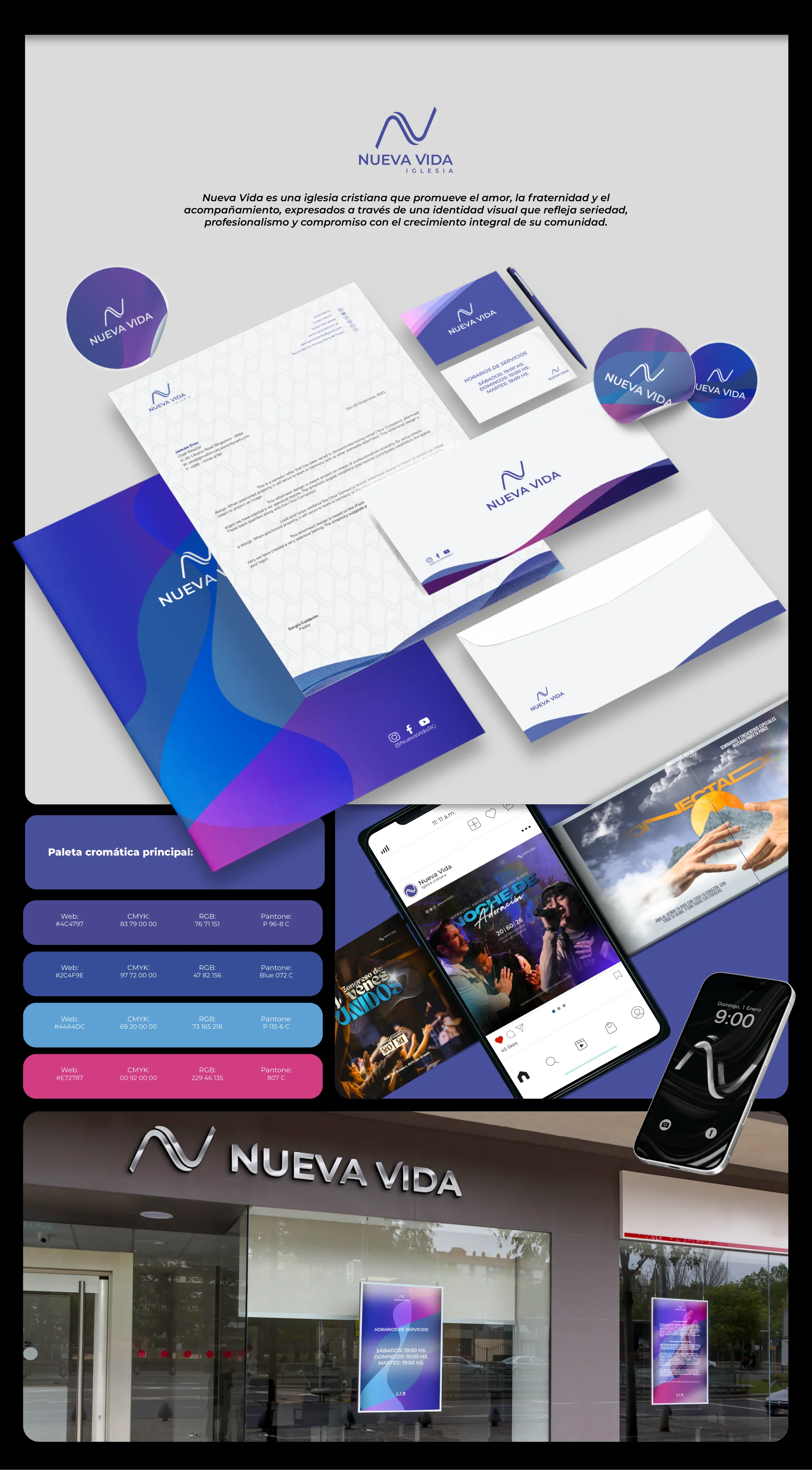
Nueva Vida brand identity board: the wave monogram logotype above the wordmark, a Spanish positioning statement, the stationery system laid out in perspective (folder, patterned letterhead, business cards, envelope and stickers in blue-violet gradients), the four-colour palette with Web, CMYK, RGB and Pantone values, social and event key visuals shown on phones, and the storefront with its metallic sign and window posters.

Case study Nº2 — NOA Deco & Accesorios
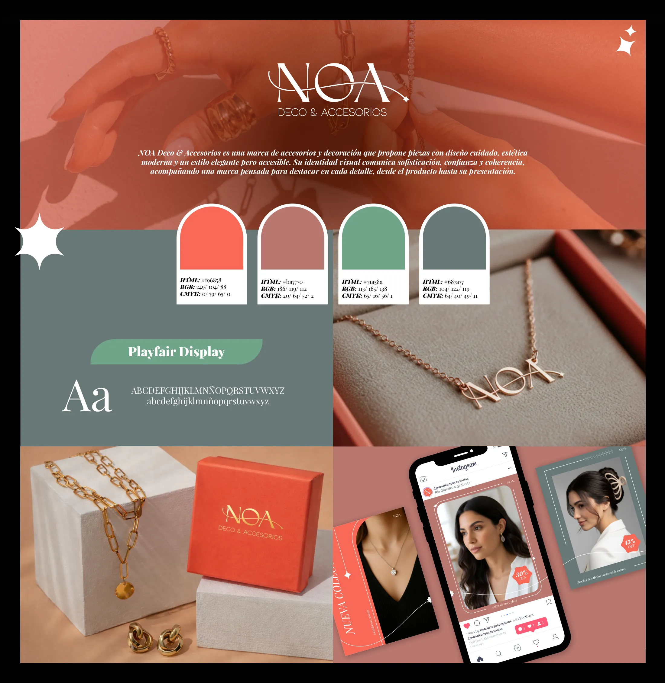
NOA Deco & Accesorios brand identity board: the logotype over a coral-tinted photograph of hands wearing the jewellery, a Spanish positioning statement, four arch-shaped palette chips carrying HTML, RGB and CMYK values, the Playfair Display type specimen on a sage panel, product and packaging photography, and the Instagram feed mocked up on a phone.